
Community-Led Project in Collaboration with La Trobe University
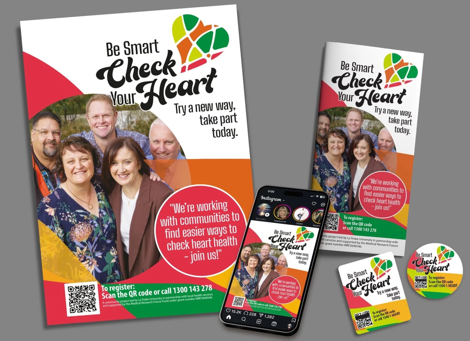
This project aimed to create engaging promotional material and a strong visual identity that reflects the shared vision of the initiative and encourages people to take part in the heart health check pilot program.
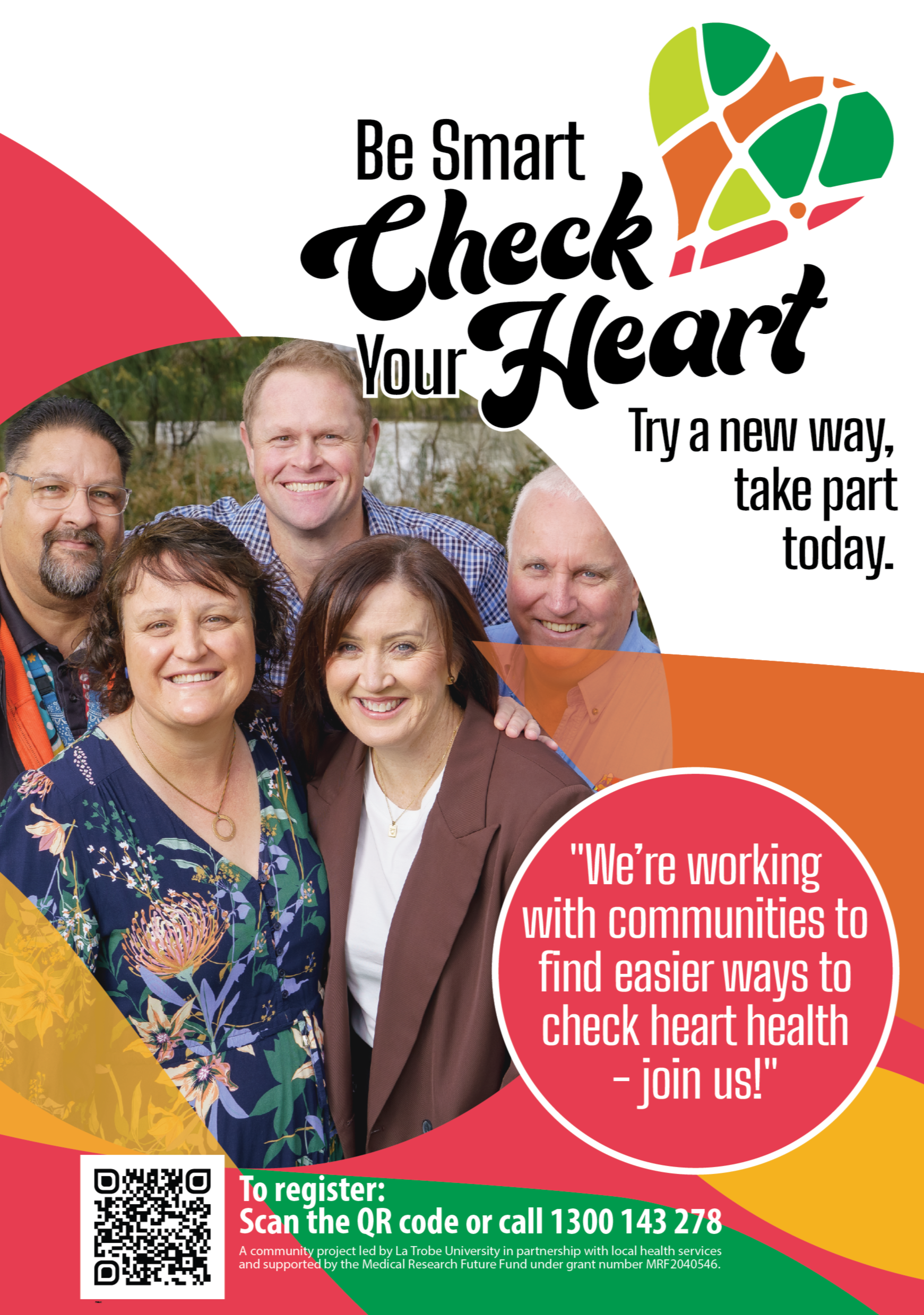
The key messaging has been shaped through insights gathered during the co-design process. Participants highlighted the importance of clear, simple and easy-to-understand language that avoids medical jargon and feels welcoming to the community. A warm and approachable tone was seen as essential in building trust and encouraging registrations.
During the workshops, participants also identified emotional barriers around heart health, including fear, anxiety and concerns about judgement. By embedding empathy, reassurance and inclusivity throughout the messaging, the campaign aims to create a supportive and positive experience for participants.
The final design direction reflects the collaborative feedback and lived experiences shared by participants and stakeholders.
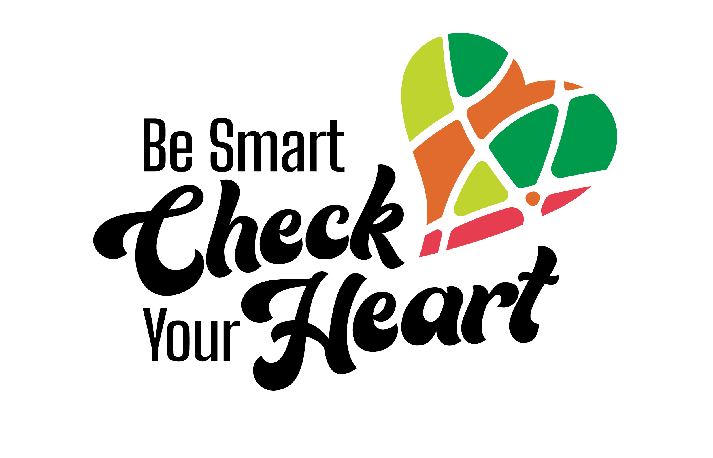
A combination of clean typography and hand-crafted design elements creates a visual identity that feels authentic, approachable and community-focused.
The colour palette draws inspiration from the region’s diverse cultures and landscapes, coming together to form a vibrant heart motif that represents connection, care and wellbeing.
The combination of typography and the simplified tapestry heart creates a distinctive and memorable brand identity that works effectively across digital, print and social media platforms.
The vibrant palette helps the campaign stand out across promotional material and social feeds, while the inclusion of local personalities helps build trust and strengthen community connection.